Project Details
Sachi the architect
UI UX Design
This project is a website redesign for an architecture studio aimed at improving how their portfolio and brand are presented online. The previous site lacked structure and clarity, making it difficult for users to explore projects. As the UI/UX designer, I focused on creating a modern, premium, and intuitive experience that better reflects the studio’s expertise and design quality.
Live project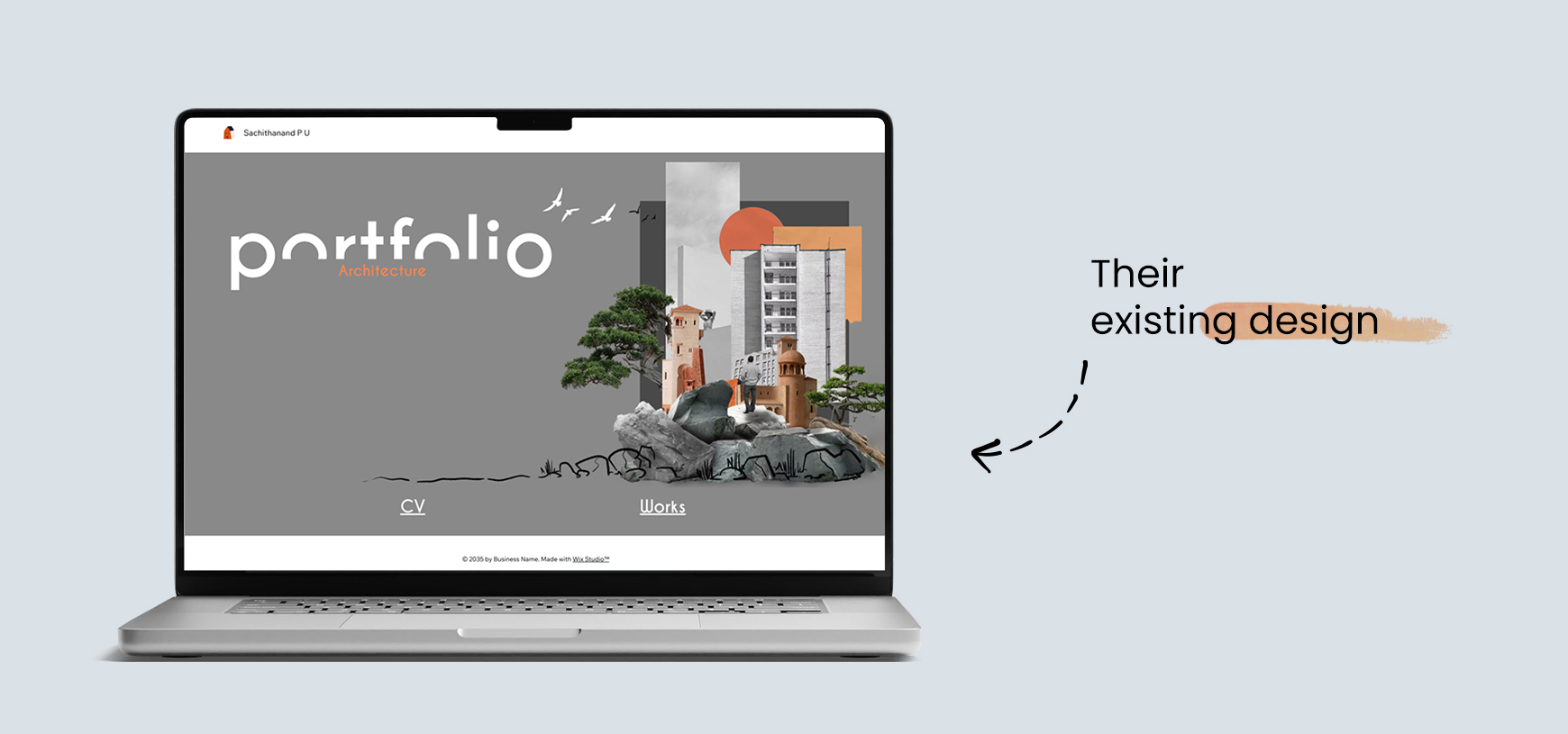
Key challenges
The old website faced several usability and design issues. The layout was cluttered with uneven spacing, clashing color combinations and no clear grid system, causing content to feel visually scattered. Typography choices were inconsistent, affecting readability and reducing the site's professional feel. The portfolio section lacked structure, making it difficult for users to explore projects or understand the architect’s specialization. Additionally, the old site did not properly communicate brand personality, had weak visual storytelling, and lacked a strong first-impression hero section. Overall, the user journey felt disconnected and did not guide visitors toward important information.
-
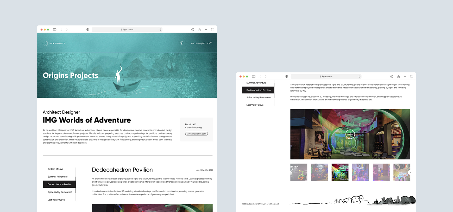
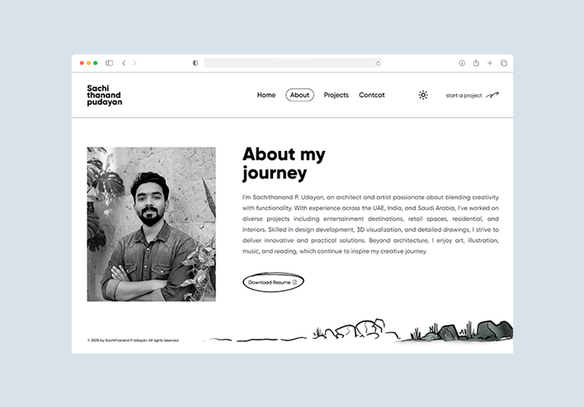
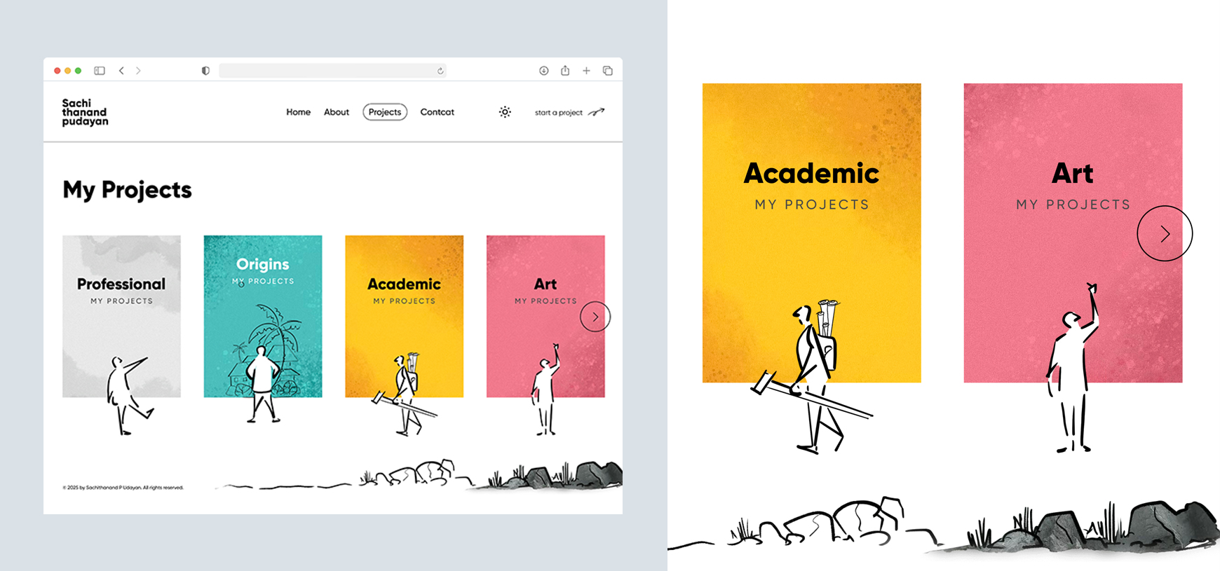
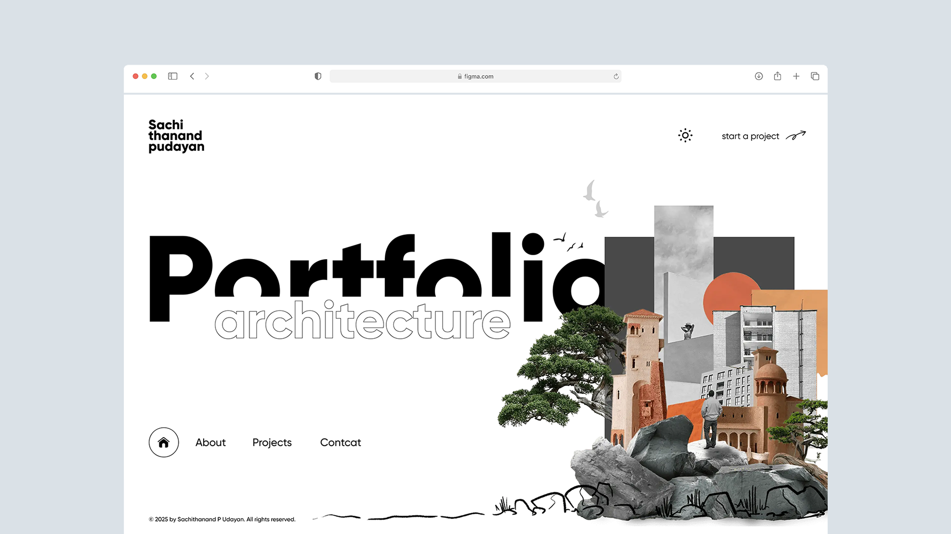
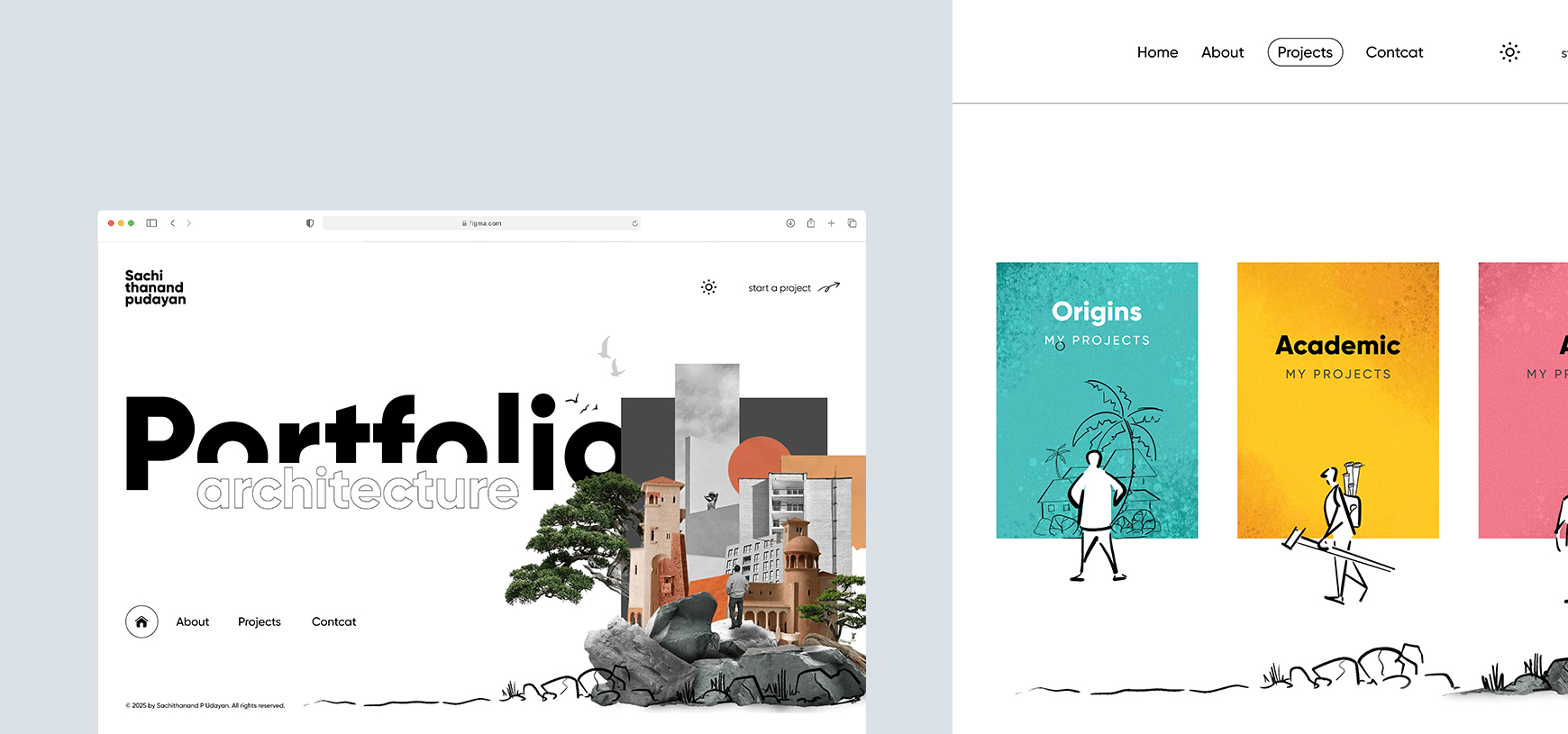
The new design focused on creating a clean, modern, architecture-driven experience. A strong grid system and spacing scale were introduced to maintain alignment and visual balance. A refined color palette and contemporary typography created a premium identity aligned with architectural aesthetics. The portfolio section was redesigned with structured project cards, consistent previews, smooth interactions, and dedicated case study pages for deeper storytelling. The hero section was improved with clear messaging and high-quality visuals to build trust instantly. Navigation was simplified and made more intuitive, ensuring users can access services, projects, and contact information effortlessly.
-
Conducted a full website redesign starting with an audit of the existing UI and user flow to identify key usability gaps. Mapped user journeys to improve service clarity and project discovery, followed by low-fidelity wireframes to define structure and navigation. Developed a modern visual design with refined typography and an architectural aesthetic, then validated interactions through interactive prototypes. Finally, implemented and tested the site on a new platform, ensuring strong performance and mobile responsiveness.
-
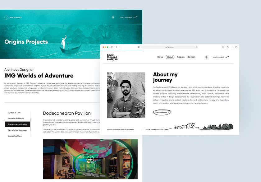
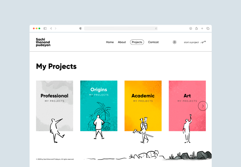
The finalized website delivers a minimal, bold, and visually polished experience. Large imagery, clean typography, structured layouts, and smooth scroll interactions present the architect’s work in a premium manner. The new UI highlights projects with high-quality visuals, detailed project storytelling, and clear categorization. The overall aesthetic aligns with architectural professionalism—clean lines, balanced spacing, and a monochromatic modern palette.
Results & Impact
The new website improved user experience significantly. Visitors now navigate easily, understand the architect’s value, and engage more with the portfolio. The clean visual style enhances brand credibility and positions the architect as a premium professional. The structured project showcase increases time-on-page and creates a visually memorable experience. Overall, the redesign successfully transforms a basic portfolio into a strong digital identity that communicates expertise and quality.