Project overview
NHRI
UI UX Design
2024
The existing website lacked clarity and made it difficult for users to understand NHRI’s roles and engage effectively. I focused on creating a clean, structured, and user-centered interface that improves content clarity, simplifies navigation, and highlights the institution’s core functions. The goal was to deliver a professional, informative, and inclusive platform that educates users, supports interactions like feedback submissions, and reinforces NHRI’s credibility online.
Key challenges
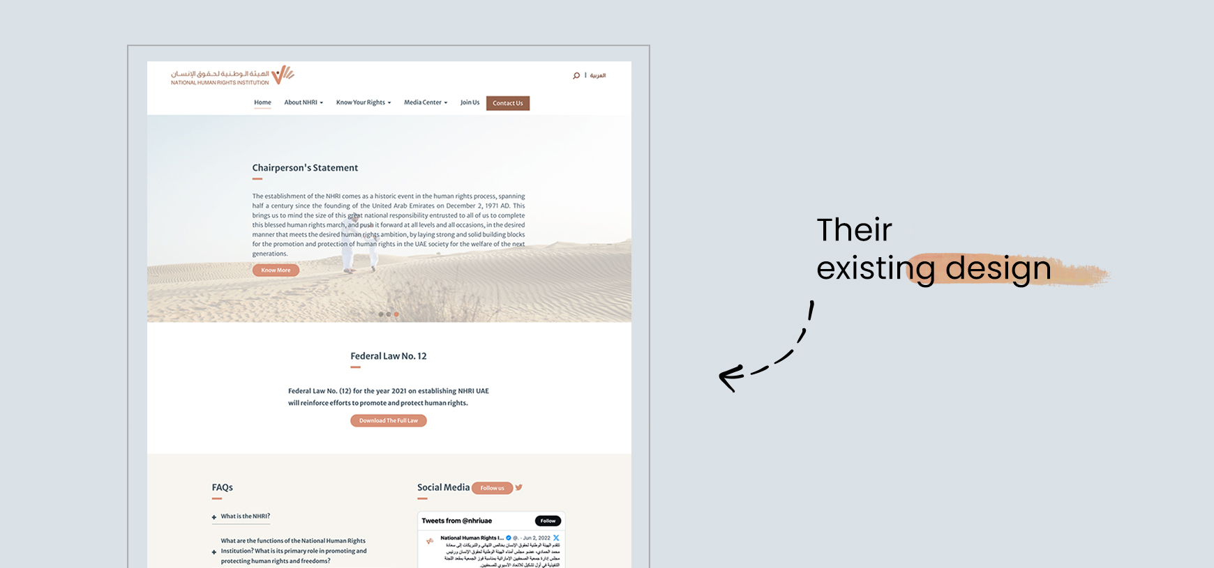
The old NHRI website struggled with multiple UI and UX issues. The layout was cluttered, with inconsistent spacing, small typography, left-aligned text blocks, and an overloaded hero section with lengthy copy, all of which increased visitor confusion. Poor design choices and a weak visual hierarchy resulted in an outdated and unattractive aesthetic. As a result, users found it difficult to easily locate important information. Key services, such as submitting complaints and understanding human rights, were hard to access. As a national human rights institution, the design failed to reflect NHRI’s identity, credibility, and significance. Although the institution has a critical mission, the current website does not effectively serve its users or stakeholders.
-
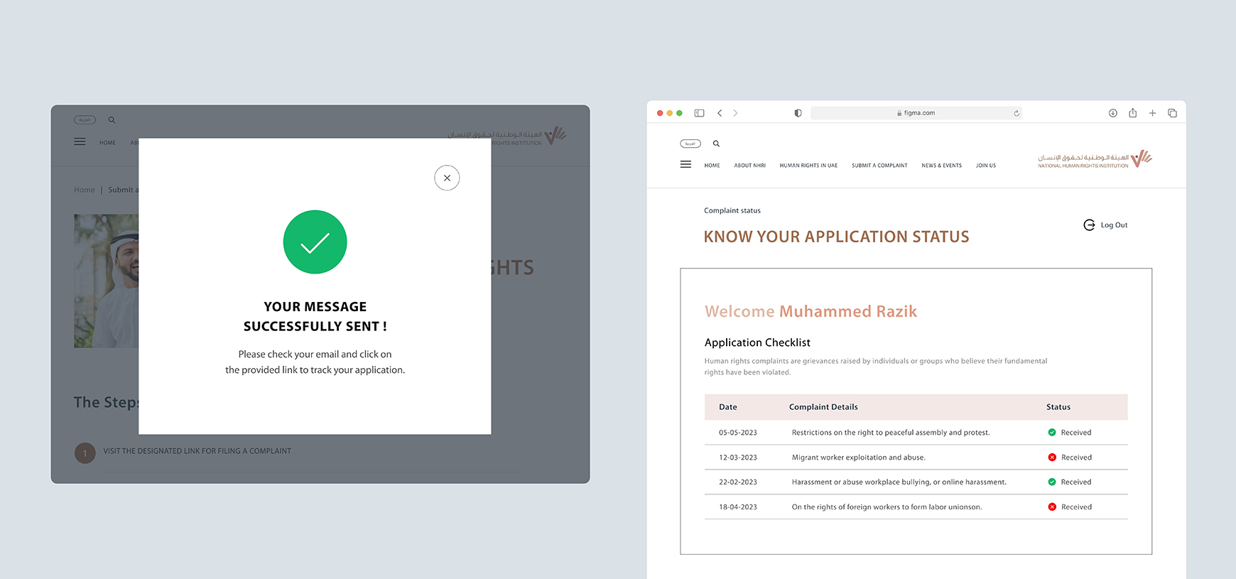
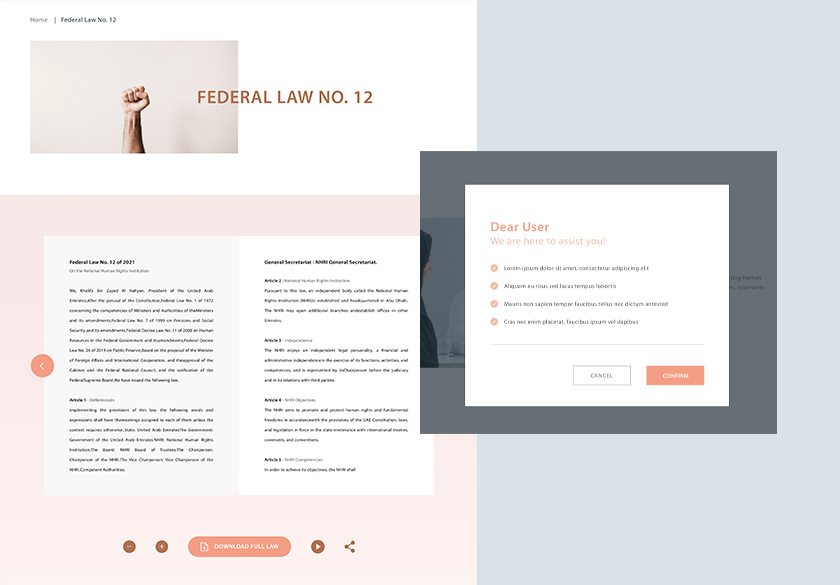
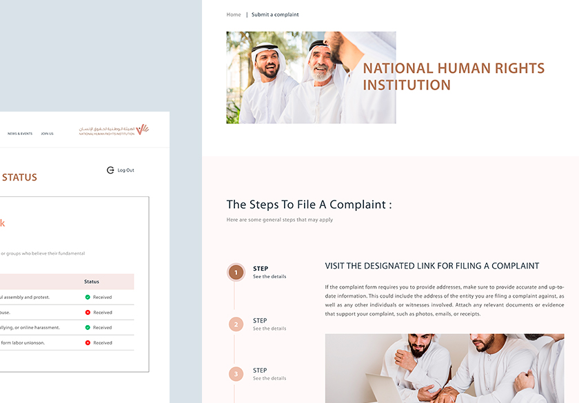
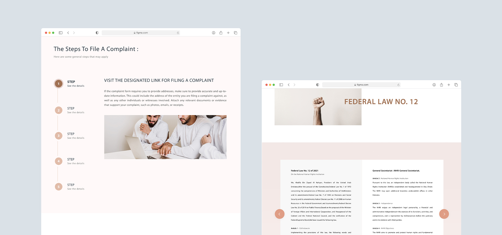
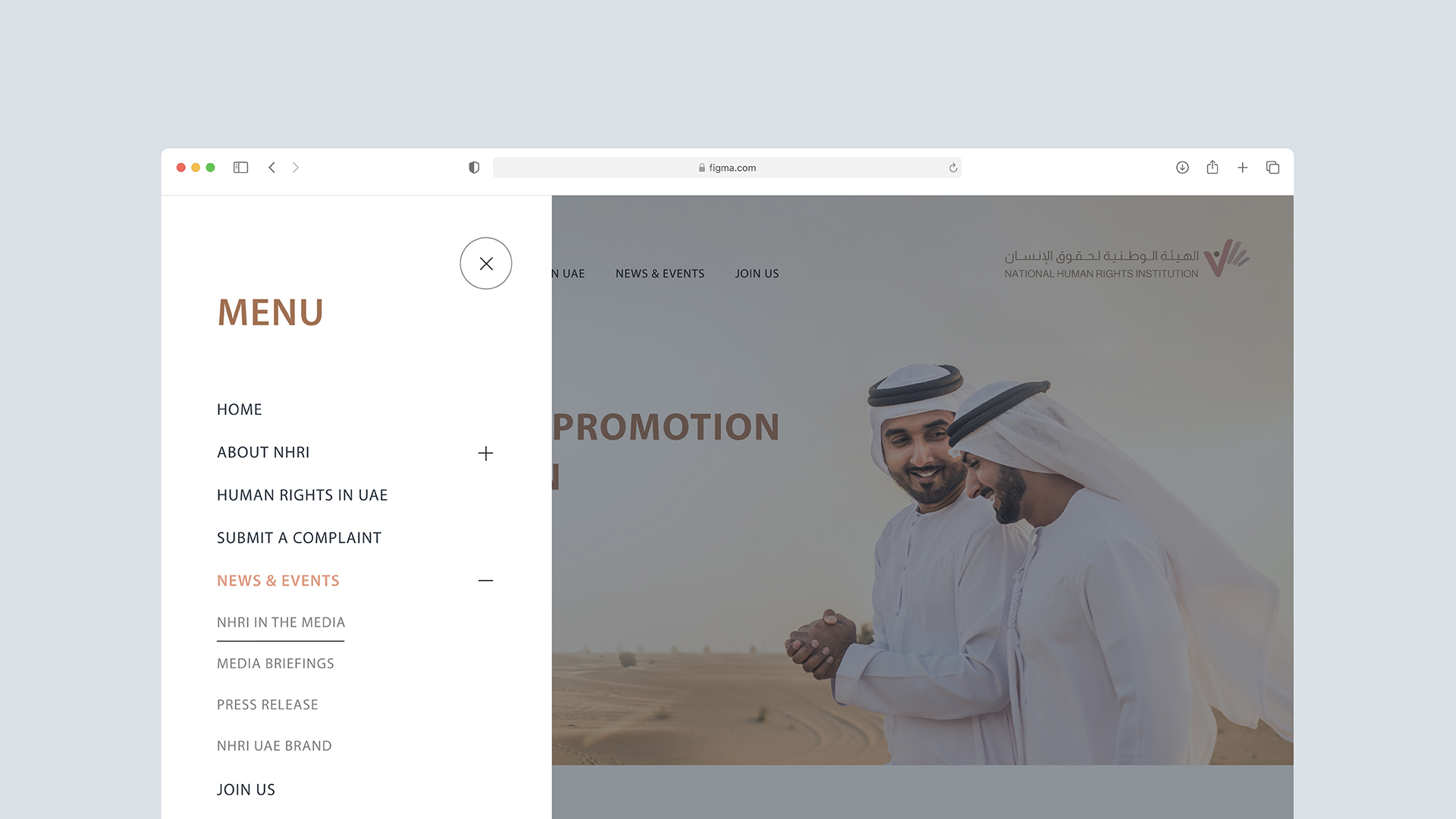
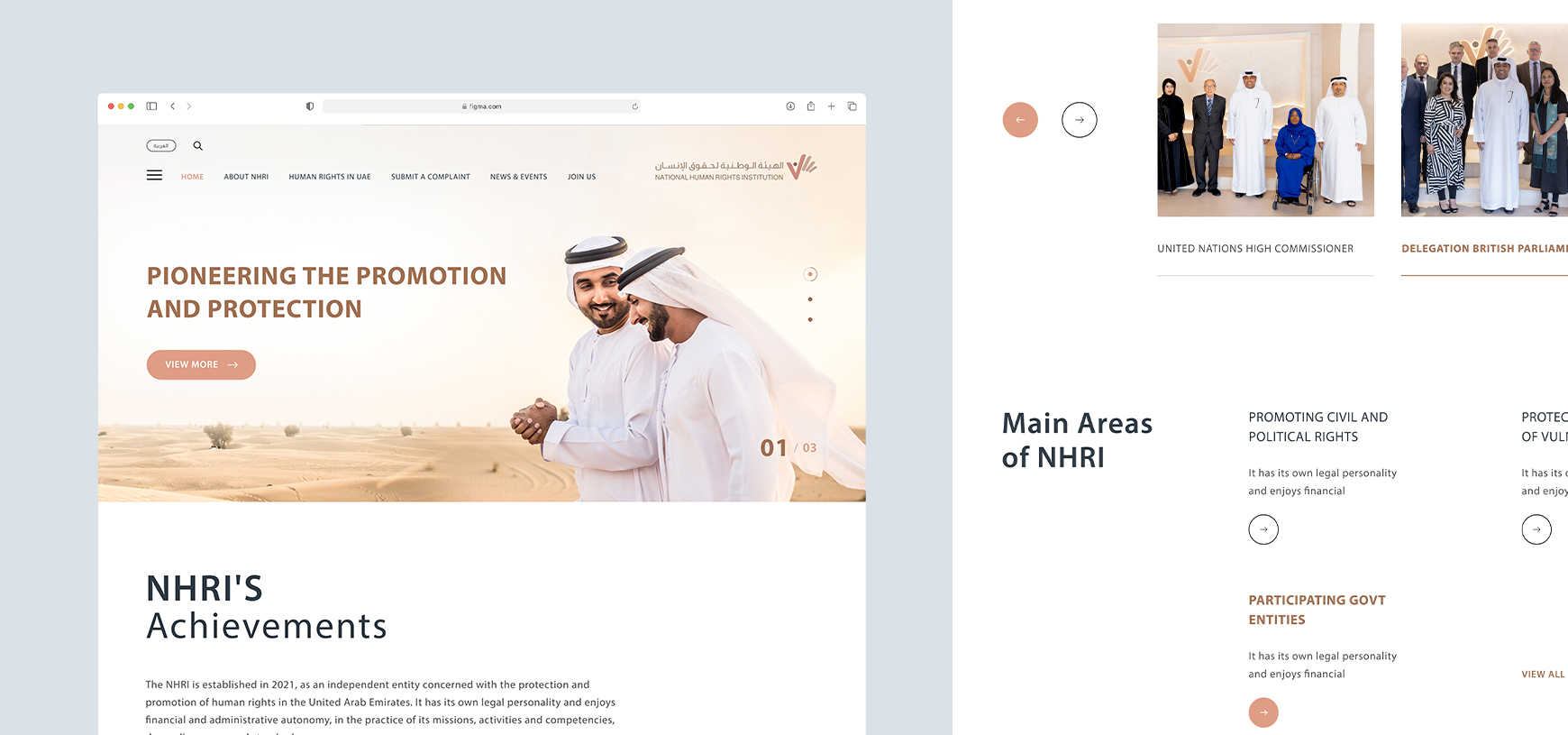
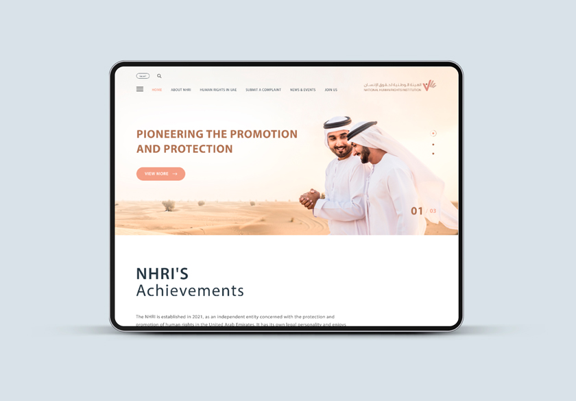
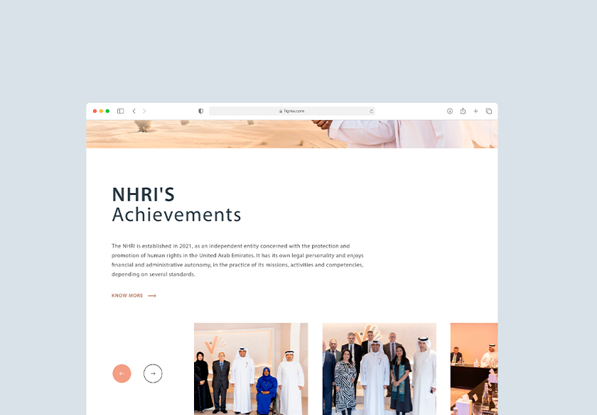
The redesign delivers a user-centered experience that clearly reflects NHRI’s mission and public responsibility. The homepage features a strong hero section with prominent calls to action, while content is organized into meaningful sections—including Services, Rights Education, Reports & Resources, and News & Media—for easier navigation and understanding. A clear visual hierarchy, grid system, refined typography, consistent spacing, and human-centered imagery enhance readability, accessibility, and credibility. Prominent call-to-action buttons guide users to essential services such as submitting complaints, learning about their rights, contacting NHRI, and accessing official reports. Overall, the redesign prioritizes clarity, usability, and professional aesthetics.
-
A comprehensive audit of the old website was conducted to identify UI layout, content hierarchy, and usability issues. Key user flows were mapped for tasks such as discovering services and accessing human rights–related information. Low-fidelity wireframes were created to establish structure, spacing, and navigation, followed by high-fidelity designs using brand-guided typography, colors, and components. An interactive prototype was built to validate usability and ensure visual consistency.
-
The redesigned UI features a clean and spacious layout with a clear visual hierarchy and prominent call-to-action elements. Services and sections are presented through intuitive, card-based layouts, making it easier to scan and navigate information. Interactive elements enhance engagement, while the improved hero section draws strong visual attention to key services, helping users better understand the content. A brand-aligned color palette and consistent spacing system further enhance readability, balance, and the overall user experience.
Results & Impact
The redesigned interface significantly improves user engagement, clarity, and professionalism. Visitors can now navigate the site effortlessly and quickly access relevant services. By reinforcing a modern and credible brand identity, it communicates trust, expertise, and accessibility. Overall, the new UI elevates NHRI’s digital presence into a user-friendly, professional, and visually compelling platform.